Back in January of this year, Shana asked me to help her with a marketing campaign for an outdoor shopping mall, Colony Crossing (an Ergon property). She had great ideas of ads and billboards we could design that would reflect the illustrative properties of the Colony Crossing website. Despite my being down about still not having a full-time job, I got excited about this. It sounded like a lot of fun and a good reason to stick around Ergon a little longer, so that I could add some stuff to my portfolio.
My first assignment was to design a half page ad for the Mississippi Business Journal. Its target audience would be business owners looking to lease a space for their business. I was given a tag line (Move To Our Neighborhood) and told to include the required text and logo that the Real Estate department gave us. Other than that I was almost free to design what I wanted! The two guys we were working with on this project said they wanted something “out-of-the-box” that would bring more people to the mall. “Out-of-the-box,” “Different,” and “Catch Attention” were phrases Shana told me they kept using over and over (I wasn’t present for the initial meeting). Well I was definitely going to give them out-of-the-box. I was going to give them something other than the standard picture-of-the-mall-with-copy-below type of boring mess they’d been using since who knows when. I was going to give them something so great it would blow their minds. I was going to show them what they’d been missing.
 |
| The best of the 3 I presented |
Well, blow their minds, I did. In fact, it went completely over their heads. We met one day in our conference room to discuss the ad/their budget/other campaign ideas. They took one look at the great designs I presented to them and said, “Well, that’s interesting.” Immediately I knew that I had wasted a good week of my life on this project.
After the disapproving looks at the ads, we discussed the pricing. A half page ad ended up cutting too far into their budget, so we decided on an eighth-page ad that would need a complete re-design. Since this was the first time I experienced these two discussing their budget, I got a little irritated at the fact that I’d just spent a week pouring my heart and soul into an ad they couldn’t even use.
So they told me how they wanted the eighth page ad to look (we talked them out of putting an actual picture of the mall into an ad so small), and this is what it looked like:
 |
| Out-of-the-Box… |
No joke.
You tell me which one was better; which one was “Out-of-the-box.” But that is exactly what they asked for, believe me, because even on that one they had a thousand changes before we could send it off.
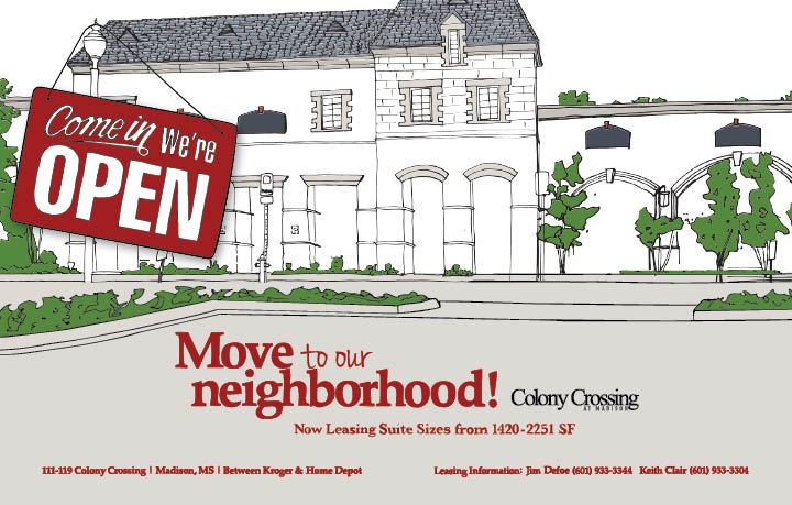
Then, about a week after we sent the black and white one off to be printed, they both came back with the Business Journal in hand and laid a half page ad down on Shana’s desk and said, “We want that, it’s so out-of-the-box.” This is the ad:
 |
| Complete with illustrated drawing. |


Leave a comment