I believe it was somewhere in the middle of my second summer at Ergon that I was assigned the most dreaded project for a beginner graphic designer: a website redesign. One day Jim decides to have a meeting with Russell (our copywriter) and me. I immediately know nothing good can come out of an almost solo meeting. And I was right. Jim tells us that he wants me to redesign the Ergon Asphalt & Emulsions website and he wants Russell to make up the copy and content for it.
Okay, this could be good for me. I need to add some web design to my portfolio. How hard can it be?
I had no idea how hard it could be.
I started with the basics: I did some research on asphalt and emulsions. Let me just tell you that I now know way too much about asphalt and emulsions. I could probably get hired as a salesperson by Ergon and be a damn good one.
Okay, maybe not. But I sure know more than I ever thought I’d ever have to learn being a designer and all… But I’m getting off topic.
After I had half an understanding of asphalt. And emulsions. I started doing research on websites: Great websites. Creative websites. Terrible websites. Simple websites. Dynamic websites. Static Websites. And everything in between. (Trust me, there’s more)
Then I did some thumbnails. Lots of them. Those were actually the most fun I had on this project. Those damn thumbnails would be the last enjoyable part of this project that I would see until it was all over.
Jim loved the thumbnails. Everyone does.
After thumbnail approval I got to work on the next-to-the-real deal. The Photoshop version of the three thumbnails I liked the best. I came up with three designs that I thought were decent. Jim saw them one day and said, “Those are very ‘Web 2.0.'” Uh oh. He then proceeded to schedule a meeting for us all to discuss the mock-ups. Uh oh.
Hold up! I like these designs! No “uh oh”! They’re awesome. I worked hard on them. They can’t not like them!
Once again, I was wrong. I’m wrong a lot.
Everyone thought they were okay. Well, for those of you who don’t know, “okay” is never okay in a designer’s world. “Okay” means “It’s a good start.” Ugh. I’m becoming an alcoholic.
So I go back to the think tree. I do some more research. What the hell do they want? These were good designs!
This time I play with color. I use basically the same layout since they didn’t seem to have too much of a problem with that. Those actually turned out worse than the first ones I presented. I wonder if my next job will pay for my AA meetings.
By now the other intern is actually feeling sorry for me and tries to help me out by telling me how she interpreted their critiques. And it actually makes sense to me.
Finally, something clicks, and I think I understand what they might want this site to be. A construction site! HELLO!! An asphalt site needs to look like a construction site! Geez.
Well, okay. I think I can do this now. I come up with three new Photoshop designs and the first look Shana gives them doesn’t say, “You really hate web design, don’t you?” Thank the Lord in Heaven!
We both picked the design that looked like a street sign and decide on the colors: Black, grey, and orange (of course). The design still needed a ton of work, but I finally understood what these web design freaks wanted! Everyone wants to hire a web designer, so maybe I could become a design freak too. Maybe…
Anyway, after a few weeks of blood, sweat and tears (literally), I got the design where everyone thought they wanted it. The next step was to build it. With code. From the ground up. And guess who was chosen to do that lovely project!
And that’s another story!
em.j.
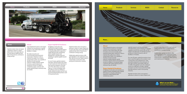 |
| Two of the layouts I’m not too ashamed of to show. |


Leave a comment